Galaxy S24FE vs iPhone 16 Pro vs Xiaomi 14T Pro - BLIND CAMERA TEST ( MCM Comic Con London )
Welcome to the blind camera test between the Samsung Galaxy S24FE vs iPhone 16 Pro Max vs Xiaomi 14T Pro…website edition. On the images below if you hover your mouse over them you will see the controls. If you tap the arrow on the image you will reveal which phone took which picture. But I encourage you to decide which looks the best before you do that. Also, tally up a score sheet and let me know which phone wins in your opinion.
PRIMARY CAMERA
So, here is a photo taken with the primary cameras, which are typically the most expensive sensors and optics on most smartphones…without thinking about which one instantly catches your eye because I want you to decide before I share some of my observations with you.
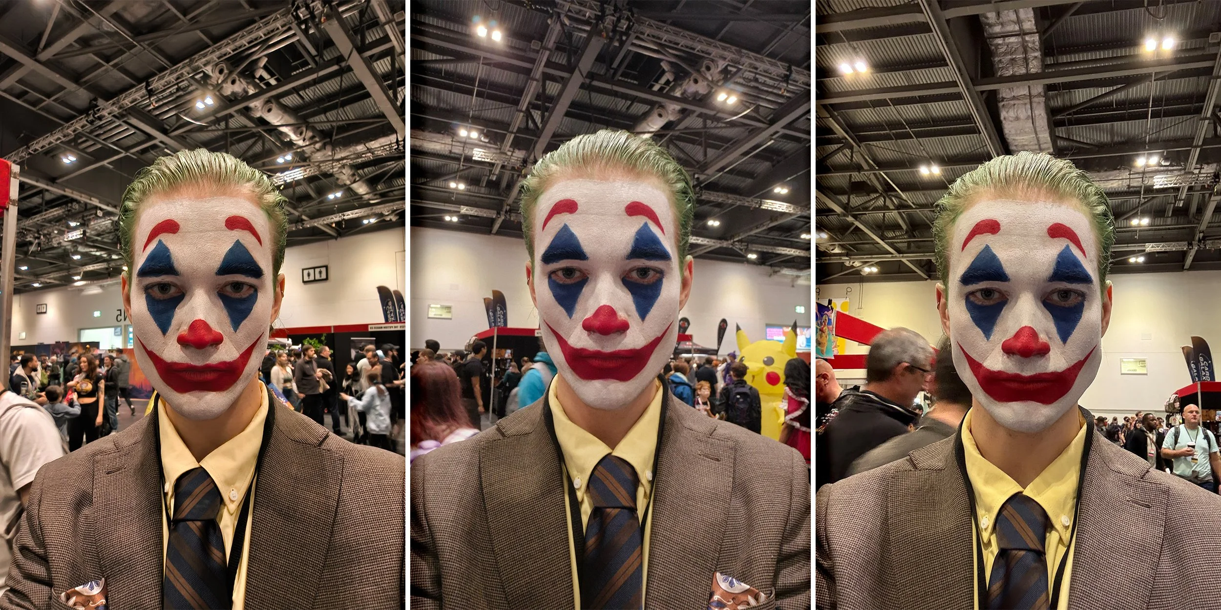
So when you zoom in a little bit here, you notice that in the centre & in the photo to the right, the shadows have been lifted quite a bit, which certainly brightens up their eyes, which looks nice, but this lifting of the darker areas may come at the cost of losing some natural skin texture and details.
I think the picture on the left-hand side is arguably the best. You'll notice a distinct difference in the colour tones, with the image on the right having more magenta tones. It looks nice… but now it's time to see what phone you picked as the winner.
PORTRAIT MODE ( REAR CAMERAS )
Ok, so the photo was taken using the portrait mode. It's designed to give you the bokeh effect, aka blurry background. The key to victory here is accurate edge detection, but at the same time, it shouldn't be so sharp that it looks unrealistic.
So, at a glance, which one is your winner based on first impressions.
Ok, now let's get a closer look and see. So let's go left to right here. You noticed blurring at the top edges of her hair. Now, this could be intentional to blend, or the camera just struggled to isolate each strand.
The centre image appears more precise and has done a fantastic job here. The overall tone of the image has much cooler blue colour tones, which looks nice too.
The phone on the right also did a good job at edge detection, but there are some unusual digital artefacts when you look closely. However, when zoomed out, it seems pretty great. The tones are relatively neutral compared to the other two and also quite contrasty. Now it's your time to decide. Which one wins here?
HIGH DYNAMIC RANGE - HDR
This was taken specially to test out the high dynamic range. This is the phone's ability to deal with strong backlighting whilst retaining details in the darker areas. At first glance, for me personally, it's got to be the image on the right. It's got good detail in the sky, and the darker details on the outfit are clear and crisp.
The phone on the left struggled a bit here, and many of the foreground details appear quite soft. The centre image looks good but not quite as detailed as the image on the right. You might disagree, and if you do, let me know. Anyway, it's time to decide.
TELEPHOTO HDR
So this is the same picture, but it was taken using telephoto cameras. Generally speaking, most manufacturers don't put as much effort into these as they do with the primary cameras. So, which manufacturer do you think performs the best here?
To see video comparisons watch the full video here.
Alright, let me know so far. Who's winning this shootout? Now we'll do a quick video test and then some more photos and then you're gonna want to see the zoom test. It's pretty interesting.
PORTRAIT SELFIE
Alright, here's a portrait selfie. And thank you so much to the lady for taking this picture. It's the perfect test for portrait mode again because the hair on her costume challenges these phones' edge detection AI. All three appear to have done a great job. I think the skin tone accuracy may be the most precise on the image on the left. But edge blurring might look a little too artificial.
The centre image has cooler blue tones and amazing edge detection accuracy, but it may be too harsh. The picture on the right is slightly too warm in colour but looks good. Edge detection is good and it's doing some softening to hairs… yeah, this is a tough one. I'm gonna let you call it. Let me know what you chose.
REGULAR SELFIE
Ok, here's a regular selfie. What's instantly noticeable about these photos is how different the colour tones are.
The phone on the right has added too much yellow. The centre phone used white in the image to balance the colours and deliver the brightest image. And the selfie on the left seems the most neutral and maybe most detailed. So pick your favourite picture, and let's see.
COLOUR TEST
Ok, it's Pikachu, and this is really a test of colours. Honestly, everyone has done well in this one.
The colours are so close this time, and actually, the main differences I notice are the colour of the desk and maybe a darker blue on the image on the right, the shallower depth of field on the image on the left & both the centre and right have done a great job in regards to fine details. I think I'm going with the image on the right. What about you?
ULTRA-WIDE
Ok, here's an ultra-wide. Again, these camera sensors and lenses are rarely as good as the primary. And they do tend to get notably less detailed at the edges. In this area, the image on the right seems to have performed the best. But if you zoom into the lady in the photo, which one has done the best in your opinion.
LED LIGHT FLICKER TEST
Ok, this was an extreme test. So, you may occasionally want to take a photo with LED lights in the frame. And really, it's down to the phone's AI to figure it out. And think when it comes to this, it seems to be a win for the centre phone…or maybe the image on the right. Which one are you going with, out of those two?
Maximum Zoom test
Let's see what happens when we push these phones to their focal length limits.
A SALTY BURGER
Ok, here is what appears to be a tasty burger. Now I got this at Gordon Ramsay's street burger restaurant at the O2…and let me just say. It was the saltiest burger I've ever had in my life… I had high expectations for this place, but it was disappointing.
Anyway, when it comes to pictures, the most realistic is undoubtedly the central image. The lights in the restaurant were hot, and it seems the phone on the left chose not to adjust for that. Some people might say the phone on the left has done ok, but for me, it's a win for the centre… more importantly, which Jordan Ramsey maximum salt burger looks the best to you?
NIGHT PHOTOS
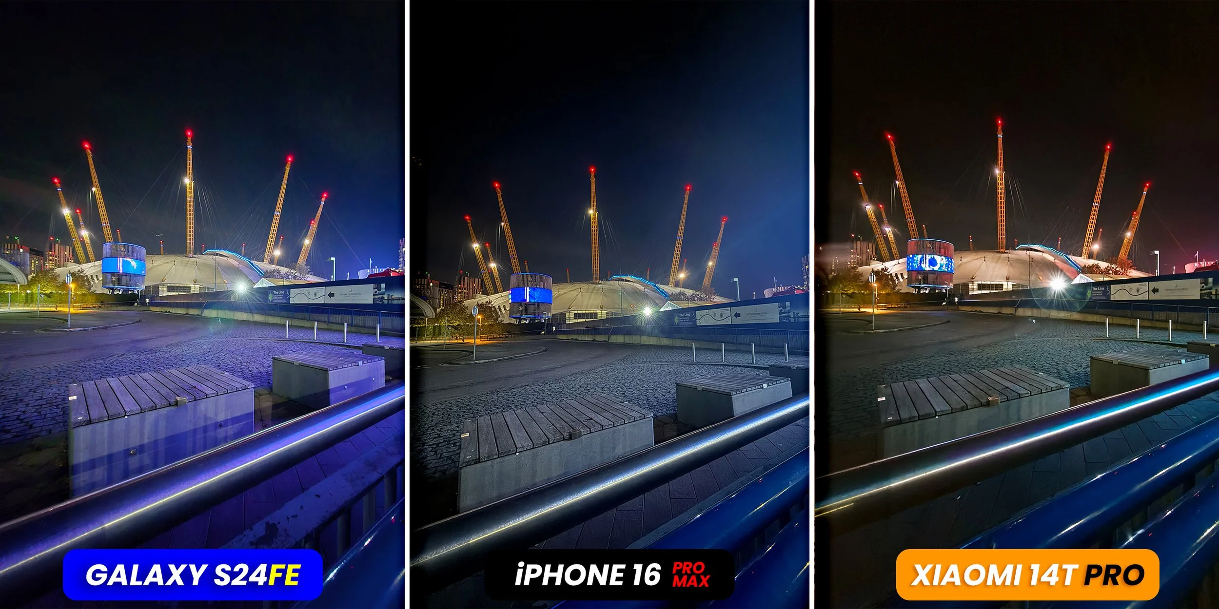
Ok, here's a night shot of the O2 millennium dome. At first glance, I think maybe the middle image looks the best. But let's zoom into one of the posts to see what's going on with the digital noise here and if we're losing any details.
So interestingly, the image on the right seems to have kept the wiring clearly visible by raising the ISO, but this does create noise in the image. The other two have smoothed this out…and the image on the left is definitely the brightest in raising the ISO. But overall, which looks the best to you?
Ok, so you made it to the end. Here are the last two shots. This is a 1x primary shot of my ugly mug. With what looks to be a CCTV camera on my head. Which one wins here?
This last one is ultra-wide, and I just want to thank the MCM team for hooking up the creator pass to the event. And finally, which one of these looks the best? Now it's time to total up your score sheet & and please do me a favour ... Let me know which scored the highest for you.
I'm genuinely interested in the results of this one..and listening to these videos isn't easy to make …, so if you did enjoy it, a little thumbs up would be much appreciated. And if you just subscribed, you are now one of the finest subscribers known to man.


